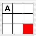
Grid grid = new
BoundedGrid(3, 3);Code
Sample 1 |
Class documentation (the API) is available from a typical, javadoc-generated
document organized alphabetically and by package, and also from a functional
index that provides links that are organized functionally into
several categories.
In addition, two other documents provide more detailed information about writing new display classes and extending the classes provided in the Grid Package. These documents are targeted at those who desire a deeper understanding of the underlying Grid Package code and those who will be modifying or extending it.
There are many introductory programming assignments that involve objects in a two-dimensional data structure. They include games, like tic-tac-toe, checkers, and chess; maze programs; simulations, like Conway's Game of Life or the AP® Marine Biology Simulation (MBS) case study†; and simpler programs that use a grid as graph paper for drawing histograms or bit-mapped drawings. These projects lend themselves to graphical representations, but the overhead involved in implementing graphical user interfaces for such assignments, especially interfaces that support user interaction, is non-trivial. The Grid Package provides a set of simple Java classes for modeling objects in a two-dimensional grid, and provides a library of other classes that make it easy to create graphical user interfaces to display and interact with such models.
The Grid Package was inspired by, and evolved from, the AP®
Marine Biology Simulation (MBS) case study. The MBS
case study introduced a two-dimensional data structure, called an Environment,
that represents the marine environment (lake, bay, or pond) for fish
in a simulation. The Grid Package introduces a similar Grid
data structure that models a two-dimensional grid made up of rows and
columns and a GridObject class that represents
objects in a grid. Each cell in a grid may be empty or may
contain one GridObject object. A GridObject
object keeps track of its own row/column location in the grid and
provides methods for checking and changing an object's location.
Subclasses of the GridObject class represent
different kinds of objects that can be placed in a grid, each of which
may have different behavior. The diagram below shows several
different kinds of grid objects in a grid. (Programmers familiar
with the MBS case study may be interested in reading a summary
of the differences
between the MBS Environment/Locatable pair and the
Grid Package Grid/GridObject pair. [not written yet!])
|
|
|
| Code Sample 1 | Figure 1 |
The Grid Package supports five basic types of graphical user interfaces for applications that use grid objects. An application might have:
The heart of any graphical user interface for a grid-based
application is the display of the grid contents. The Grid Package
provides a ScrollableGridDisplay class that knows
how to display a grid. The application, though, needs to specify
how to display the individual objects in the grid. (The procedure
for doing this is described below in the Displaying
objects in a grid section.) Several display classes, such as ColorBlockDisplay,
TextCellDisplay, and
DefaultDisplay
(displays a question mark), are provided in the Grid Package.
Furthermore, there are several classes for displaying images, such as ScaledImageDisplay and
PictureBlockDisplay,
that provide an easy way to display other kinds of grid objects without
writing
graphics code.
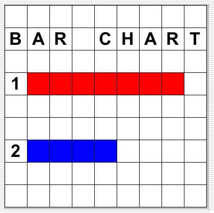 Figure 2a |
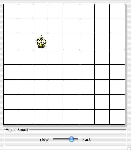 Figure 2b |
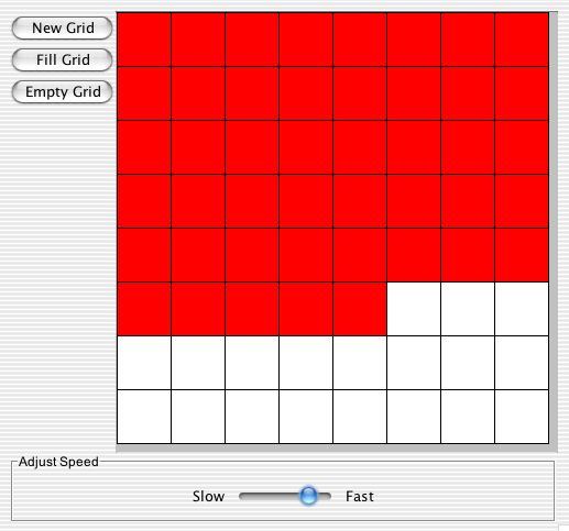 Figure 2c |
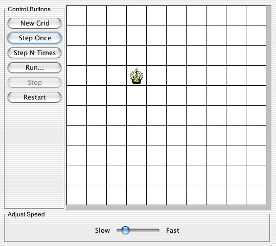 Figure 2d |
The components for creating grid applications using the Grid Package
class library are provided in three Java packages. The classes
for modeling a grid and its contents are in the edu.kzoo.grid
package. The classes for displaying the contents of a grid are in
the edu.kzoo.grid.display package. The classes for
creating a graphical user interface for a grid application are in the edu.kzoo.grid.gui
package. In addition, there is a separate package, edu.kzoo.grid.gui.nuggets,
that contains a handful of small, ready-to-use GUI components, such as MinimalFileMenu,
NewBoundedGridButton, ClearGridButton,
BGColorChoiceMenu, and so on. Finally, there
are a
handful of useful classes that are not specific to grid-based
applications, such
as the Debug and ValidatedInputReader
classes,
that are found in the edu.kzoo.util package. All
of
these classes
have been bundled together into a single Java archive file, grid.jar.
The most important classes in the Grid Package class library are the
Grid class (and its subclasses), which models a
two-dimensional grid made up of rows and columns, and the GridObject
class (and its subclasses), which represents objects in a grid.The Grid
class is an abstract class and so cannot be instantiated.
Subclasses of the Grid class may represent a grid
in various ways, including as a two-dimensional data structure that
keeps
track of the contents of each cell in the grid, as a bounded or
unbounded ArrayList of grid objects, or as a
mapping
of grid locations to the objects at those locations. The Grid
Package
includes a BoundedGrid class that uses a
two-dimensional array, an ArrayListGrid.Bounded
class that keeps track of the number of rows and columns in the grid
and contains the grid objects in an ArrayList, and
an ArrayListGrid.Unbounded class that uses an ArrayList
to store the grid objects in a grid without defined boundaries. BoundedGrid
and ArrayListGrid.Bounded objects are constructed
with a specific number of rows (R) and columns (C);
the valid locations in the grid range from (0, 0) to
(R-1, C-1). An ArrayListGrid.Unbounded
object does not have a specified number of rows or columns, and all
locations are valid, including locations with negative row or column
numbers. (Rows and columns in any Grid are
of type int, so the constraints on locations in an ArrayListGrid.Unbounded
are those imposed by the int type.)
The ArrayListGrid.Bounded and ArrayListGrid.Unbounded
representations are possible because all GridObject
objects keep track of their own location, an object of the Location‡
class. (The Location class represents
a row, column pair.) The Grid Package provides three sample GridObject
subclasses, ColorBlock, PictureBlock,
and TextCell.
Applications may create others. For some GridObject
subclasses it may make sense to keep track of which direction the
object is facing (e.g., north, south, east, west); the Direction‡
class supports this. Figure 1 above illustrates how to create a
bounded grid containing two grid objects, a color block and a text
cell. Figure 3 illustrates the inheritance and component
relationships among the key classes for modeling objects in a
grid.
Figure 3
The classes that model a grid and its contents are in the edu.kzoo.grid
package. More complete descriptions of these classes and their
methods can be found in the javadoc documentation.
The Grid Package class library provides an interface, GridDisplay,
describing objects that know how to display a grid and its
contents. Any class that implements this interface must implement
the showGrid method that client code (or a graphical user
interface) uses to display the grid.
The main class for displaying a grid and its contents is the ScrollableGridDisplay
class (a display that can be put in a scroll pane, making it
scrollable). It extends the Java Swing JPanel
class, and so can be used as one of the components of a graphical user
interface. The example below shows how an application can create
and display a grid with two color blocks in it; it does not, however,
show how to create a window containing the display. (For a
complete example, see Components for
creating graphical
user interfaces or the Example1
class in the ExampleSourceFiles folder.)
// Construct an object to display a grid. Specify how to display Code Sample 2 |
showGrid message, a scrollable grid
display object displays the grid's background color, calculates the
size of the grid display and the size of the individual cells within
the grid, creates scroll bars if necessary, and paints the grid
lines. It then goes through the list of objects in the grid and
displays them.
As in the Marine Biology Simulation program, the Grid Package class
library looks in a DisplayMap‡ to find
out how to display the various types of objects in a grid. The DisplayMap
is a table associating GridObject subclasses with
objects that know how to display them, each of which must satisfy the GridObjectDisplay
interface. For any object in the grid, if the DisplayMap
contains an entry corresponding to that object's class, then the
associated display object is used. Otherwise, it looks for a default display
class or a default image corresponding to the class such as ClassNameDisplay,ClassName.gif,
or ClassName.jpg. If
there is no entry in the DisplayMap, nor any default display
specific to the object's
class, it looks for an entry or default display corresponding to the grid object's
superclass. This continues up the class hierarchy for
the grid object. If the DisplayMap does not
have a display object specified for any class in the grid object's
inheritance hierarchy, the grid display will use a DefaultDisplay‡ object,
which displays a question mark ('?').
The application is
responsible for establishing the associations between the classes used
for grid objects and the objects that know how to display them, unless they
match the default display patterns of ClassNameDisplay,ClassName.gif,
or ClassName.jpg. In
Code Sample 2 above, the statement
DisplayMap.associate("ColorBlock", new ColorBlockDisplay());
specifies that objects of the ColorBlock class
should be displayed using the given ColorBlockDisplay
object. (This particular call
to DisplayMap.associate was not actually
necessary, since the ColorBlockDisplay object to display
a ColorBlock matches the ClassNameDisplay pattern.)
The list below shows the classes provided in the Grid Package class
library that can be used to display objects in a grid. In
addition to the DefaultDisplay class, there are
classes to display ColorBlock,
PictureBlock,
and TextCell
objects in a grid, and the ScaledImageDisplay class
to display images
(pictures in GIF and JPEG format, for example)
for all objects in a class.
GridObjectDisplay (interface for display
objects in a DisplayMap)ScaledDisplay (abstract class that
provides methods for scaling a display) TextDisplay (displays a colored text string,
centered in a specific cell)TextCellDisplay (displays a
TextCell object in the appropriate cell)DefaultDisplay (displays a question
mark in the appropriate cell)ColorBlockDisplay (paints the
appropriate cell with the color specified by the object in that cell)ScaledImageDisplay (displays a specific image
in the appropriate cell)PictureBlockDisplay (displays the
image specified by the object in that cell)There are also decorator classes (currently two) that can be applied
to a display class to add
to its
functionality. The decorator pattern was used to prevent an
exponential explosion of classes as more and more specific attributes
are desired for display types. Decorators are added to a display
with the addDecorator
method. They can be removed using the removeDecorator
method. This allows dynamic changes to be made while the program
is running. The first decorator is the RotatedDecorator,
which causes the display to change direction when the
object does. The object must have a direction
method that returns a Direction
object in order for the display to work.
The second decorator is the ScaledImageTintDecorator.
It tints the image based on the color property of the object with which
it is
associated. It can only be applied to a ScaledImageDisplay,
and the associated object must have a color method.
RotatedColorObject
and RotatedTintedExample
in the ExampleSourceFiles folder provide an example of
an application whose objects keep track of their direction and display
it using
a RotatedDecorator.
RotatedTintedExample
shows the use of a ScaledImageTintDecorator.
The following list shows the structure of the decorators included:
DisplayDecorator
(abstract class that defines the necessary decorate
method)
RotatedDecorator (decorator that allows
the display to change direction when the object it is associated with
changes direction)ScaledImageTintDecorator (tints an image
based on the color of the image -- only applies to ScaledImageDisplay)The classes for displaying a grid and its contents are in the edu.kzoo.grid.display
package.
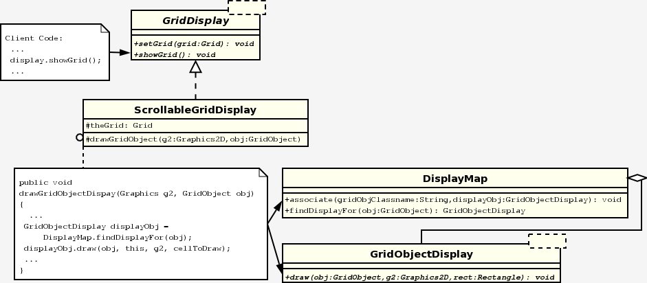
Figure 4
The Grid Package class library provides several classes that
implement graphical user interfaces for grid-based applications.
These are found in the edu.kzoo.grid.gui package.
The basic GUI class is GridAppFrame. The
simplest type of object of this class merely creates a window
containing a ScrollableGridDisplay. Two
steps are necessary: the application must create a GridAppFrame
object and then send it a constructWindowContents
message, specifying a phrase to appear in the title bar, the grid
background color, the width and height of the window, and the minimum
size of an individual grid cell. The last three values (window
width and height and minimum grid cell size) are expressed in pixels.
String TITLE = "Example GUI"; Code Sample 3 |
The GridAppFrame class itself implements the GridDisplay
interface, with a showGrid method that merely passes the
responsibility on to its ScrollableGridDisplay
method. Thus, we can create a complete application that displays
a grid containing two color blocks simply by adding the following code.
// Specify how to display color blocks. Code Sample 4 |
Example1
in the ExampleSourceFiles folder is very similar to this,
but displays several TextCell and ColorBlock
objects
in a bounded grid in a format to suggest a simple, labelled histogram
similar
to that shown in Figure 2a. Example1Alt
is
functionally equivalent to Example1,
but uses an alternative form for constructing
objects
in a grid that comes from the AP® MBS case study.
The GridAppFrame class
has several methods, such as includeMenu and includeSpeedSlider,
for specifying additional features before the constructWindowContents
message
is sent. For
example, the following code would create a graphical user interface for
an
animation, with a window containing a scrollable grid display, a
minimal file menu with a Quit
option only, and a slider bar controlling the speed of the animation
(actually the length
of the pause after each display of the grid contents).
// Construct a window to display an animation in a grid. Code Sample 5 |
(Note: MinimalFileMenu is in the edu.kzoo.grid.gui.nuggets
package.)
An application that fills the grid with color blocks provides a very simple example of an animation. After specifying how to display color blocks and constructing a grid, the application displays the initial, empty grid and then fills it with color blocks, redisplaying the grid each time.
gui.showGrid(); Code Sample 6 |
Example2
in the ExampleSourceFiles folder implements another
simple animation using an equivalent graphical user interface. In
the
Example2
animation, a queen moves diagonally on a single-colored chessboard,
from one location to the location below it and to the right. (We could
use color blocks to create a black-and-white chessboard, but
unfortunately we wouldn't be able to put any chess pieces on it, since
we cannot have both a color block and a chess piece in the same
location of a grid. It is possible, though, to customize the grid
background
to
be checkered, as shown in Example 6.) When
the
queen
reaches
the
last
row
or
column, she cycles back to location (0, 0). This
application uses a BoundedGrid object to represent
the chessboard and a generic GridObject object,
which merely keeps track of its current location, to represent the
queen. The application "moves" a queen by removing the piece from the
board
and adding a new GridObject instance to the grid
at the new location. It displays the queen graphically using an image
of a crown. The key steps for implementing the animation are:
DisplayMap.associate.A step in this simple example is a move to the cell below and to the right of the current cell.
The Grid Package supports two types of user-driven
applications. One type allows users to control an application
through a set of buttons. The GridAppFrame
class provides an includeControlComponent method for
putting buttons and other components in a control panel to the left of
the grid display.
Several buttons and other simple components are provided in the edu.kzoo.grid.gui.nuggets
package. For example, a NewBoundedGridButton
object brings up a dialog box that prompts the user for the number of
rows and columns, and then creates a new BoundedGrid
object with the specified dimensions. A ColorChoiceMenu
component provides a drop-down menu from which a user can select a
color; a BGColorChoiceMenu is a specialized ColorChoiceMenu
that
changes
the
background
color of the grid. A ClearGridButton
object removes all objects from the grid. The example below
creates a user interface with components that allow a user to construct
a grid, change its background color, and remove any objects that might
be in it.
// Construct a window with a new grid button, a background color Code Sample 7 |
includeControlComponent method takes two
parameters: the component itself and an indicator of when the component
should be enabled (clickable) or disabled (grayed-out and not
clickable). The EnabledDisabledStates class
defines a set of constants describing a range of enabled/disabled
criteria, including NEEDS_APP_WAITING and NEEDS_GRID_AND_APP_WAITING.
The first of these indicates that the component should be enabled
whenever the application is ready and waiting for user input, as
opposed to actively executing a button action, for example. The second
indicates that the component requires a defined grid. Thus, the
"New Grid" button is enabled when the user interface is first created
but the "Empty Grid" button is not enabled until after a grid has been
created. Both buttons become disabled while other button actions
are being processed.
In addition to using the classes provided in the edu.kzoo.grid.gui.nuggets
package, it is relatively easy to create a new control button.
The abstract ControlButton class extends the
standard Java
JButton class to provide an option to display the
grid after
executing the button action. The ThreadedControlButton
extension
(also abstract) provides the basic infrastructure for creating a
control button
that
runs
in
a
separate thread, enabling and disabling other components appropriately
as it runs. Executing the button action in a
separate thread means that certain other user interface activities,
such as updates to the display and changes to the slider bar, may
happen concurrently without waiting for the button action to
complete. Subclasses of ControlButton orThreadedControlButton
must implement the abstract act
method, which performs the core button action. The following ControlButton
subclass resets the graphical user interface by setting the grid back
to null and resetting the speed slider bar back to its
initial
value. Similarly, one could create a FillButton
subclass of ThreadedControlButton whose act
method
would
fill the grid with color blocks using
code similar to that provided above
in the section on creating animated grid applications.
public class ResetButton extends ControlButton Code Sample 8 |
Example3
in the ExampleSourceFiles folder uses code similar to
that found in this section to create an application in which users can
create a new grid, set the background and fill colors, fill the grid
with color blocks, clear out the contents of the grid, or reset the
user interface as above. Example3
also includes a MinimalFileMenu and a BasicHelpMenu
object that provides information about the application, such as the
author and version.
Example 4, which consists of three classes: Example4App, Example4GUI, and Example4AppControl,
provides another example of an application with control buttons.
Example 4 provides a "New Grid" button and a customized "Start" control
button that, in this case, moves a queen down the diagonal of a
chessboard 10 times. Thus, apart from its use of control buttons,
this example is functionally similar to Example2. The more
significant difference, though, is in its implementation, which
separates the graphical user interface from the application
control. Example4GUI
is pure interface code, with no knowledge of the application it is
running. It delegates that responsibility to Example4AppControl
by having the "Start" button (another ThreadedControlButton
subclass, although this time implemented as an anonymous inner class)
call the control class's runAnimation method, which
handles moving the queen in the grid. The user interface class
doesn't even know that what kind of grid object it is dealing with or
how to display it; the call to DisplayMap.associate is in
the main method in Example4App
along with one line of code to construct the graphical user interface
object. The usual calls to the include... and constructWindowContents
methods are in the Example4GUI
constructor.
The Grid Package provides a way to automatically generate ThreadedControlButton
buttons from the methods of a class. Consider, for example, a PatternMaker
class that has a set of "drawing" methods, each of which puts a
different pattern of color blocks in the grid. Each drawing
method takes a Color object as a parameter, to
indicate the color of the blocks to place, and has a void
return type. To generate a set of buttons corresponding to these
drawing methods, construct a GeneratedButtonList
object, passing it a PatternMaker object to which
messages can be sent and an array of arguments to send with each
message (in this case, an array containing only a Color
object.) Then pass the generated list to the includeControlComponents
method (note the plural) in the graphical user interface. The includeControlComponents
method will add each generated button in the list to the control panel
in the graphical user interface. When an automatically-generated
button is pressed, it invokes the corresponding method on the target
object (in this case the PatternMaker object),
passing it the argument(s) provided to the GeneratedButtonList
object when it was constructed. It may also redisplay the grid
and its contents after the button action is complete, depending on the
value of the last parameter to the GeneratedButtonList
constructor, displayAfterButtonPresses.
Usually the automatically-generated buttons have the same names as
their associated method; a drawBox method will generate a
button labeled "drawBox." If the method name matches the special on...ButtonClick
format, though, the button label will consist of the interior
substring; an onDrawCircleButtonClick method will
generate a button labeled "DrawCircle" rather than
"onDrawCircleButtonClick." It is also possible to reset the label
on a button using the resetButtonLabel method in GeneratedButtonList.
The Example5App,
Example5AppControl,
and
Example5ColorChoiceMenu
classes
in
the ExampleSourceFiles folder provide an example of an
application,
some of whose control buttons are drawing buttons that were
automatically generated
from methods in
the Example5AppControl
class. The Example5ColorChoiceMenu
class
provides a drop-down menu from which to choose the color of the
color blocks being placed in the grid. When the user selects a
different
color the Example5ColorChoiceMenu
object
changes the value of the Color object in the array
of method
arguments passed to the automatically-generated control buttons.
The control buttons in the preceding section are appropriate for
tasks as units, in which clicking on a button initiates a task that
continues until it is complete. Some applications, though, are
better represented as an ongoing cycle of repeating tasks. For
example, a simulation might consist of a sequence of timesteps.
The Grid Package allows users to control such an application through a
choice of Initialize, Step, NSteps, Run, and Stop buttons provided by
the SteppedGridAppFrame subclass of GridAppFrame.
The set of control buttons that are visible on any particular SteppedGridAppFrame
graphical user interface depends on the include...
messages sent to it before the application constructs the window
contents. Although the SteppedGridAppFrame
object provides the specified control buttons, it does not know what
actions the application should perform in response to them. For
this, it requires that the application define a controller class (a
subclass of the abstract SteppedGridAppController
class). The SteppedGridAppFrame object
relies on
the controller object to know how to initialize or restart
the
application,
what
actions
to perform
in a single step, and what the criteria are for stopping a running
application. The
user-defined controller class implements these behaviors in redefined init,
step,
and hasReachedStoppingState methods, respectively.
(All SteppedGridAppController subclasses
must implement the step method, but may leave out the init
method
if there is no Initialize button or leave out the hasReachedStoppingState
method
if there are no set criteria for stopping a running application.)
The following example is a stepped variation of the program that
moves a queen down the diagonal of a chessboard 10 times. The graphical
user interface provides Step, Run, and Restart buttons but relies on
the QueenAnimation
controller class to define how a queen moves in each step and how to
re-initialize the board. Although it would be possible to create
a Queen class with a move method,
this application, like the previous examples, uses a generic GridObject
instance to represent a queen, displays it with an image of a crown,
and "moves" it by removing it from the board and adding a new GridObject
instance to the grid at the new location.
Code to create the controller and graphical user interface:
boolean DISPLAY_AFTER_EACH_STEP = true;
boolean DISPLAY_AFTER_RESTART = true;
QueenAnimation controller = new QueenAnimation();
SteppedGridAppFrame gui =
new SteppedGridAppFrame(controller, DISPLAY_AFTER_EACH_STEP);
gui.includeStepOnceButton();
gui.includeRunButton();
gui.includeSetResetButton("Restart", NEEDS_GRID, DISPLAY_AFTER_RESTART);
// Include a New Grid button and a speed slider and
// construct window contents in the usual way.
DisplayMap.associate("edu.kzoo.grid.GridObject",
new ScaledImageDisplay("GoldCrown.gif"));Code Sample 9
Key code from theQueenAnimationclass:
public void setGrid(Grid grid)
{ // Whenever a new board is chosen, call init.
super.setGrid(grid);
init();
}
public void init()
{ // If a queen is already on the board, remove her.
// Insert new queen at location (0, 0).
getGrid().remove(currentQueenLoc);
currentQueenLoc = new Location(0, 0);
new GridObject(getGrid(), currentQueenLoc);
}
public void step()
{ // Remove queen from current location; insert new queen
// to the lower-right or back at location (0, 0).
getGrid().remove(currentQueenLoc);
int newRowCol = (currentQueenLoc.row() + 1) % getGrid().numRows();
currentQueenLoc = new Location(newRowCol, newRowCol);
new GridObject(getGrid(), currentQueenLoc);
}Code Sample 10
Note that the step method in this example assumes that
the grid is square, or at least
that the number of rows is not greater than the number of
columns. The Exampl6App
and
the Example6SteppedController
classes
in the ExampleSourceFiles folder provide a more general
and complete
implementation for this simple animation, including an NSteps button,
which
lets the user run the application for a set number of steps, a Stop
button,
and a checkered background.
A different type of user-driven application supported by the Grid
Package allows users to control an application with mouse-clicks in
various grid cells. This requires creating a GridAppFrame
subclass that redefines the onMousePressOverDisplay
method. This method takes as a parameter the location of the grid
cell in which the mouse has been pressed. The version of the
method in GridAppFrame does nothing, but
subclasses can redefine it to provide mouse-driven behavior. For
example, the following MouseDrivenGUI class
illustrates a graphical user interface that either adds an object to
the specified location in the grid if a user clicks on an empty grid
cell, or removes an object from the specified location if a user clicks
on a cell containing an object.
public class MouseDrivenGUI extends GridAppFrame Code Sample 11 |
Example7
in the ExampleSourceFiles folder is an extension of GridAppFramethat
uses
code
similar
to
this to create a mouse-driven application in which a user can add
queens to, or remove them from, a chessboard. It also includes a
file menu with a Quit option and a New Grid button. The main
method for Example 7, which merely constructs the graphical user
interface, is included in the Example7
class.
The classes you need to use the Grid Package class library are
provided in a single Java archive file, grid.jar.
Exactly how you compile and run your Java source files with this
archive file depends on the development environment you are
using. For example, the UNIX command-line statement to execute
Example
6 in the ExampleSourceFiles folder with the grid.jar
file
two folders
above it would
be:
    javac -classpath .:../../grid.jar Example6App.java Example6SteppedController.java
    java -classpath .:../../grid.jar Example6App
If you wish to use images to display objects in the grid, the images need to be in the directory where the application is running. This might be where your project information is, where the jar file is, or where the source files or compiled class files are, depending on the development environment you are using.